Buttons in Flash Catalyst
Now it’s time to create some buttons in Flash Catalyst!
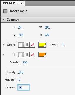
Use the Rounded Rectangle tool to create a rounded rectangle. Adjust the corner roundness, colors and filters in the Properties panel.

You will get a shape that looks like a button.

Now it’s time to turn our button-looking shape into a button component.
Every time we create a Rectangle you would have noticed that a ‘Rectangle’ panel pops up. This is called the HUD and can be turned on and off via the main menu as well from Window > HUD.

- Click on the button rectangle. The HUD appears.
- Click on “Choose Component” under “Convert Artwork to Component”
- Select “Button”

- The HUD will change to “Button” allowing you to customize the carious states of the button.

Clicking on any of the Up, Over, Down or Disabled buttons will allow you to change the look of the button on these states. The rest of the page will be grayed out and you can change the properties of the rectangular button only.

Use the Text tool to type out the text “About Us” over this button like shape.
Give the text a different colors in the Over and Down States. You can select the text and change the color in the Properties panel. For the ‘Over’ state, you can use the eyedropper tool in the color picker to pick the exact same orange color used for the outline of the button.

You can use a yellow for the ‘Down’ state.
This is what the different button states look like now:

We can not get out of the button states and back onto the main artboard by clicking on greyed out ‘website’ (our project name) beside /Button1 in the black band above the artboard.
Our webpage now looks like this:

Flash Catalyst Tutorial
- Flash Catalyst Tutorial
- Create a New Project
- Flash Catalyst Workspace
- Flash Catalyst Tools
- Flash Catalyst Webpage
- Logo Design in Flash Catalyst
- Webpage Layout in Flash Catalyst
- Buttons in Flash Catalyst
- Pages/ States in Flash Catalyst
- Interactivity in Flash Catalyst
- Transition Effects in Flash Catalyst
- Publish the Flash Catalyst Website
Posted in Flash Catalyst Tutorial | No Comments »